Basics of CSS3 styling of HTML5 blog post
2013-02-14In the blog post Basics of HTML5 blog post I started to show how a simple blog post can be structured and given semantic value to the different sections of the post. I earlier said that the semantic sections in a HTML5 document are good for search engines when they want to understand what the different parts of a web page contains of. The HTML5 semantic sections also have the benefit of that it is easier to style the visual appearance of section in the document with help of CSS3 (Cascade Style Sheet) file. For instance maybe you want to have a specific background color of the header section in the document. In this blog I have a HTML5 section called <header>, then I can make a specific style to everything that is in this tags section.
It's always good to separate concerns from each other. In this case we are separating semantics and the data of the HTML document and the layout of the document in the CSS file.
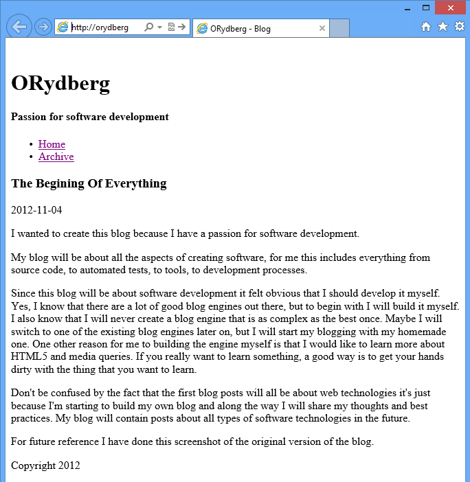
The blog looks like this without the styling from the CSS file:
The blog looks like this with the styling from the CSS file:
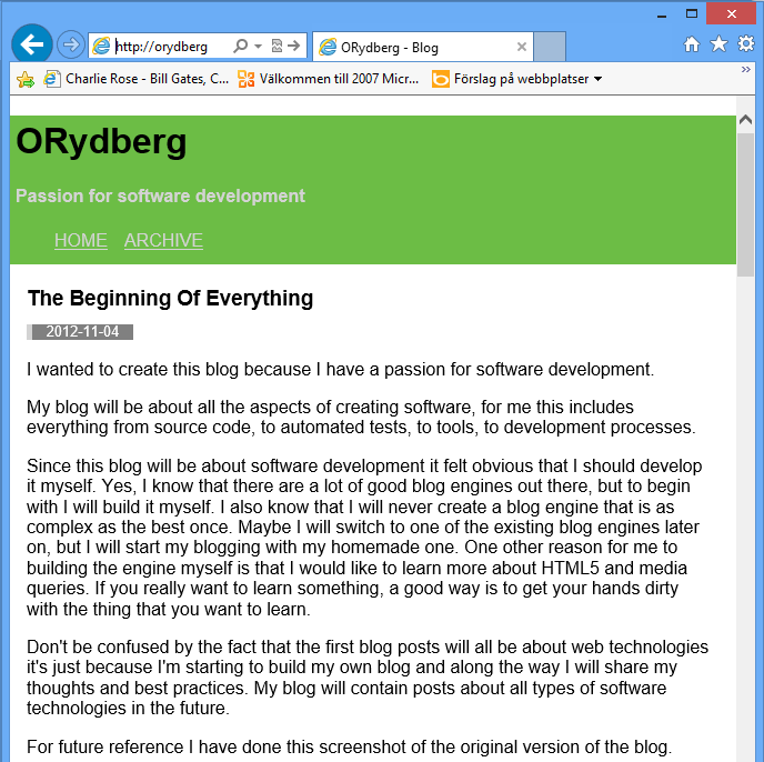
As you can see there is a very big difference between how the two pages are displayed in the browser. So, in this way I have separated the styling from the content of the blog. It’s always a good idea to separate the different concerns in for instance this way.
To apply CSS styling to a HTML document you need to connect the CSS file to it with this line of code in the <header> section of the HTML document:
<link rel="stylesheet" type="text/css" href="styles.css" media="screen">This tag will connect the HTML file to the styles.css file and styling in the CSS file will be reflected in the page when it will be rendered in the browser. As you can see in this tag the media attribute is set to screen and that means that this style sheet will only be used if the HTML is displayed on a screen. There are also other media types like printer, so you can have a different layout when the page is printed.
Cascade Style Sheets (CSS) fundamentals
The CSS version 3 is made to work together with HTML5. With a CSS file it's possible to change the appearance or the style of the entire HTML document or for everything inside a specific section of a HTML tag. It's also possible to set the color of the text in the whole document ant then override the color for, for instance the <H1> tag.
The <header> section of this blog is styled with a green background color.
In the CSS file this is specified with this code:
header {
    background-color:#6CBD45;
}
So, this means that I have first specified the <header> section in the HTML document and then set the property background-color to this green color (#6CBD45).
Example of some properties that you can modify with CSS code:
| Property name | Description | Code example |
| border-width | Sets the width of the four borders. | border-width:1en; |
| border-left-color | Sets the color of the left border. | border-left-color:#ff0000 |
| font-size | Specifies the font size of text. | font-size:100% |
| background-color | Sets the background color of an item. | background-color:yellow; |
| text-align | Specifies the horizontal align of text. | text-align:left |
With for instance these properties it's possible to change the color, size, position and other things for the entire HTML document or for a H1 tag.
Use Media Quires to fit different screen sizes
As you know people use very different screen sizes when they are reading a blog post. It could be everything from the smallest cell phone like 3" display with 320*480 pixels to a computer screen like a 27" monitor with 2560 x 1440 pixels. First, you might think that it sounds impossible to create a blog design that looks good on that small cell phone screen and on the large computer monitor and it's probably true that it's an impossible task. But there is hope, because with Media Queries you can create different layouts of your blog depending on for instance the size of the screen it's being rendered on.
A good first step is to have a layout of your blog for cell phones and one for computer screens. It's a lot of talk about that you should do mobile design first and then the design for larger screens. This is a good approach because the design for the mobile screen needs to be very clean and have very few details and then it's easy to add more details to a larger screen design, instead of removing things if you do the mobile design last.
Now let us dig into some code that will help with creating a good experience for your mobile user. First you need to add this line to the head section in your HTML page.
<meta name="viewport" content="width=device-width, initial-scale=1">This line will trigger your browser to render your blog page at a more readable scale. If you don't have this line mobile browser will pretend that it's a large computer monitor and the text on the page will be very small, you have to zoom in to be able to read the text.
Next step is to do changes to your page layout that fits a small screen better. One obvious example is if you have margins to the right and the left of you blog text, you should remove that when you are on rendering your page on the mobile display.
To do that we can write this code in the end of the CSS file:
Body{
  Width:80%;
}
@media screen and (max-width:799px) {
  body{
    width:100%;
  }
}
So this part of code means that if the number of pixels on the screen is less than 800 pixels the blog part should take 100% of the screen instead of 80% as it was specified as earlier. If you set a property again later in the CSS it will override the first value that you have set.
Relative an absolute units
There are 2 types of units that can be used for specifying the width, height or size of an object. These types are absolute units like pixels, points or centimeters and the other type is relative units like percent or em:s.
In the world today we have web browsers on many different screen sizes from small devices like cellphones to large TV screens. To be able to have a good experience on all these different sizes it’s preferred to use a relative unit when setting the size for a text and graphical objects.
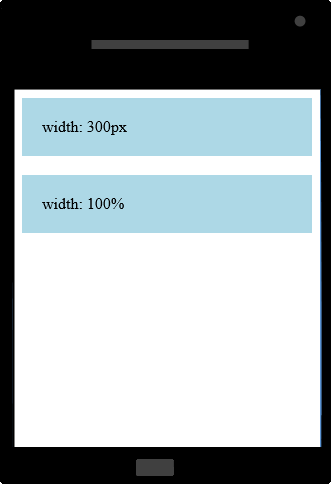
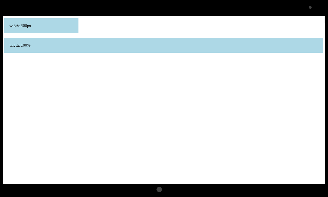
One of the simplest ways to show that it’s better to use a relative size like percent instead of a specific size like pixels is to compare what happens when you try to display a bar where the width is set with pixels and one bar set with percent on you web page. Then if you show the same web page on a tablet and on a mobile phone like this. Now you can see on these two images the pixel width is the same on both of the devices and the bar where the width that was set with percent is always filling the width of the screen. If you want to create a blog page that is adapting to different screen sizes it’s obvious that it’s good to use a relative size.
 |
 |
This was a short introduction of a modern way of using CSS for styling a web page that would look good on all types of devices.
Some interesting links: